February 27, 2013

Get it in Gear

I recently became aware of Kenny K digital stamps.  I've wanted to try digital stamps for a while, and as they've got a free download, I thought I'd check it out.  I wanted to see how easy it would be to use the png file they provide in my Silhouette studio software to create a cutting file.  It went quite easily (though I did have to tweak a few of the lines, as I'm a bit of a perfectionist when it comes to crafting).  Anyway, I liked how it worked and decided to buy a few images, as I really like the artwork on these (note, some of them tend to the adult side of imagery while others are kid friendly).

I'm entering this card in their blog challenge for this week, Layer it up.  I'm also entering it in Simon Says Stamp's Anything Goes challenge.

This is one of the most complex cards I've made in a while, with quite a number of materials and steps. But I love how it turned out.

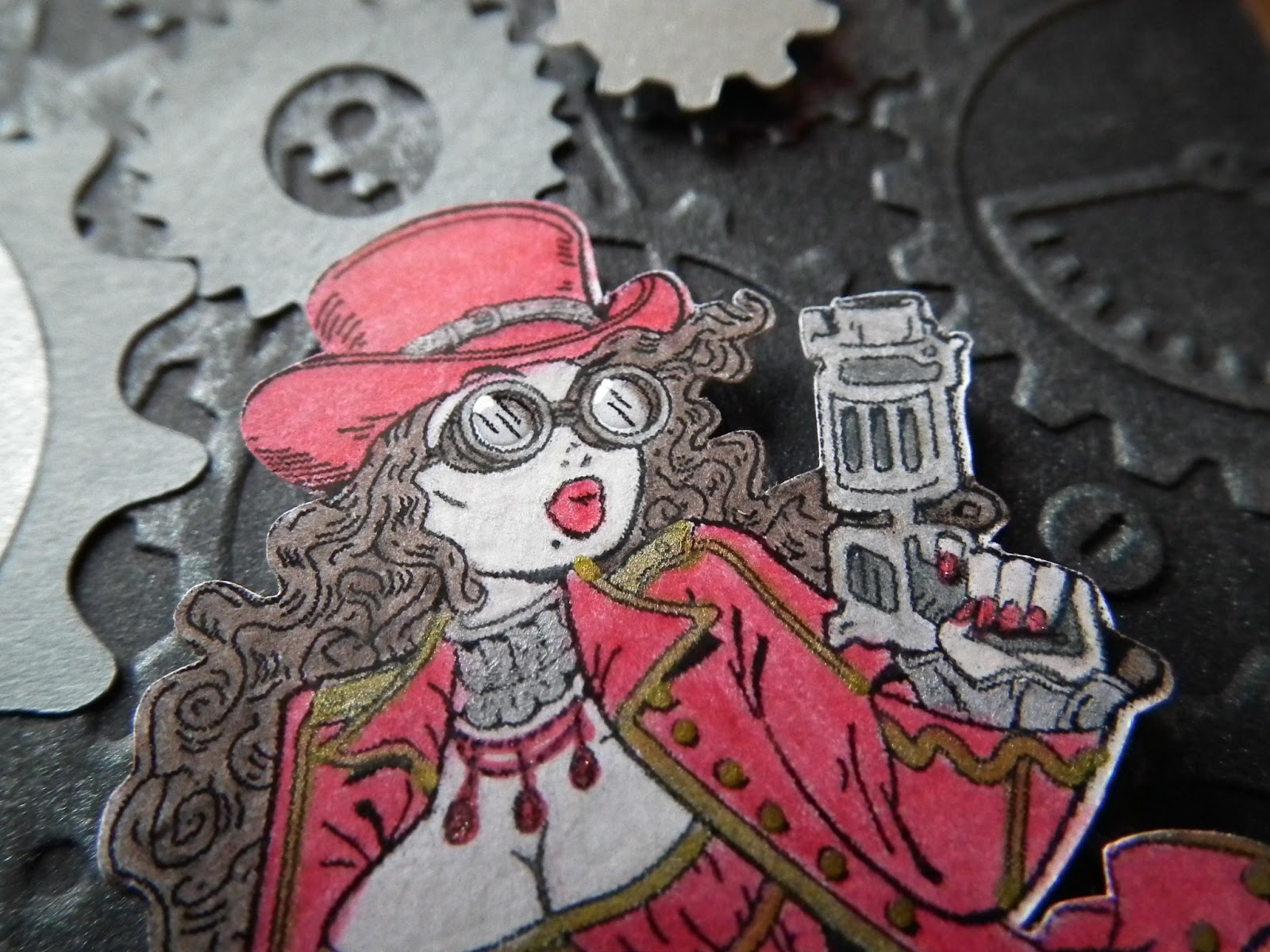
I started by embossing the background and rubbing a silver Gelato stick over it. I wanted a rougher look so I made sure the coverage wasn't complete.  I also only wanted it on the raised pieces and so rubbed with some care.  I then buffed the Gelato with a dry craft sponge (I wasn't too thrilled with the finger or tissue attempt last time.  The sponge worked great, not stealing too much colour, while giving good coverage).

The next step was to get my Kenny K image - Scarlett West.  I imported her into my Silhouette studio program, traced her to get a cut outline and then polished the outline a bit.  I wanted the outline to show, and so made it a bit larger than the printed image (obviously this worked better in some areas than others, but I didn't mind how it turned out).  I also had to add cutting areas around the hip bag, as that wasn't part of the trace.

I forgot to add my registration marks, so when I printed the image and put it in the Silhouette for cutting, there was no way for the machine to know where the image was.  Yeah, that took a bit to figure out.  Once I had the registration marks on, I printed it again and then cut the image.  I love how little work this will be in the future.  I don't mind fussy cutting small images, but something this complex takes time and that's better spent doing other types of crafting.

While I had the Silhouette on I decided to cut out various sized gears in silver and black cardstock for decorations.

I coloured Scarlett West in with pencil crayons and then went over it with gamsol and blending stumps so the colour looked uniform.  I didn't bother much with shading for this image, being impatient to see the card put together.

I finished her off with some gold and silver markers and a red gel pen,  I also added dabs of glossy accents (rather than my usual Mod Podge, which was just so messy for small jobs) to the goggles.

To finish it off, I die cut a tag and stamped the sentiment on it.  It's a cling stamp and I had to write the sentiment on the back myself, making placement a bit tricky (as evidence by the fact that it's not centered here).  I used two brads to hold it in place.  The gears are alternately glued on and popped up, but I tried to make the teeth line up so it would look realistic.  I also popped Scarlett.

Supplies:
Cardstock: Recollections white, silver, black, grey
Kenny K digital stamp: Scarlett West
Stamp: Kimmie's Steampunk Sentiments
Embossing Folder: Cuttlebug - Clockworks
Die: Spellbinders Fancy Tags 2
Pencil Crayons: Berol Canadiana
Faber Castel Pitt Markers - gold & silver, Gelato - silver
Studio gel red pen
Memento ink
Glossy Accents
Create Impressions screw top brads
gamsol & blending stumps
pop dots, glue

February 22, 2013

Butterfly Cameo Card

I started this card by stamping the butterfly background.  I stamped the lace border and then the cameo, which I backed with black cardstock.  I popped the cameo up with pop-dots and finished the card with some red highlights on the cameo and a red rhinestone.
Supplies:
Cardstock: Recollections, cream resume paper
Stamp: Close to my Heart - Sweet Moments
Ink: Memento, Crayola marker
Dollar store rhinestone
pop-dots


February 21, 2013

And a card

Yes, this is an older card but I feel bad for not posting any this week so it's what you're getting.  This is a male Congratulations card, with minimal embellishment.

I started out by using a metal embossing plate to emboss the image on silver paper (which I can now run through my Bigshot, since I have the rubber pad, etc.  It's so much easier than trying to see where the metal is under the paper, even with a lightbox).


I cut out some of the holes with a craft knife, stamped the sentiment in Top Boss watermark ink and embossed it in black.  It came out a bit messy, but this is for a guy so I figured that would be ok.  I put it on a black piece of cardstock, and used 2 black jewels for accent.
Supplies:
paper: Recollections cardstock, silver envelope lining (how's that for recycling?)
Embossing Template: Marianne Design EH1818
Stamp: Kaisercraft Wedding Sentiments
Zing embossing powder
Top Boss watermark ink
Jolee's bling

I'm such a lucky person

Sorry for the lack of posts this week.  I worked extra and have been rather tired because of it.  Which means I haven't had time - or energy - for card crafting.  That doesn't excuse my not posting older cards, but whatever.

This is the last 'winning' post I've got, as the last of my December/January prizes just showed up.  I love blog hops, and how generous craft companies are when sponsoring them. :)  And I was lucky in that I not only had the time to participate in quite a number of hops, but that I won several prizes. :D

This is what I got from A Blog Named Hero's Christmas-travaganza 2012.  Their sponsors were Hero Arts (hence their name) and Clearsnap, which makes the Color Box inks.  The green ink is a colour I've wanted for a while, so that was quite lucky, and I've been admiring people's solid inked image cards for ages, but didn't have any stamps to try the effect with, until now.  As for the white pigment ink, I've got a mini one, so this larger one is great too.

And the second kit from Um Wow Studio:
It's so pretty!  I love the butterflies and flowers.  I'm getting lots of ideas about how to spruce up embellishments from these kits.

Now I just need to find the time and energy for more crafting, so I can put these new supplies to good use.

February 15, 2013

Media Sampler

I recently learned about a pencil crayon technique for blending that I wanted to try.  I also wanted to see how it compared with other techniques, so I've done a sampler.

For the sake of easy comparison, I'm putting the images together with explanations below.  I've uploaded the pictures to Picasa, if you want to see them larger.

Crayola (water based) Markers
Pencil Crayons
Pencil Crayons with Gamsol for blending

Water Colours (pencils + water brush)
Chalk
 
Gelatos - dry
Gelatos - wet
1. Markers:  I don't own enough Copics (or other alcohol based markers) to do a good test with them, so this is with Crayola markers.  It's more to show the depth of colour of markers vs the other media than a sample of marker blending, as water based markers don't blend the way alcohol ones do.  Please keep that in mind when you look at this picture.  I'd intended to do some minor blending, but the second blue I chose turned out to be too dark for the technique I was thinking about and so I didn't end up doing that.

2. Pencil Crayons: You can blend pencil crayons by pressing harder or lighter, or by layering one colour over another.  I just did basic colouring, so it would be easier to compare with the other images.

3. Pencil Crayons + Gamsol.  This is the original technique I was testing.  I saw this video explaining the process and wanted to try it.  Gamsol is an alcohol that removes the wax from pencil crayons, allowing you to blend the colour with a blending stump.  If you buy Gamsol from an art store you have to buy a lot (I got 16 oz), which will last ages as long as it doesn't evaporate on you.  Apparently some craft stores sell it in smaller (2 oz) quantities.  I poured a small amount in a tiny bottle for use, dipped in a blending stump, and blended the picture.  I loved the soft, almost water colour look it gave.  And as the alcohol evaporates, there's no warping the paper.  I thought belatedly I should try drawing the veins on the leaves and blend the colour out, so I tried that with my next media below.

4. Water colour: I have a set of pencils/crayons with a water brush, so that's what I used here. With the flowers I coloured the outlines and drew the colour to the center with the water brush.  For the leaves, I drew veins and tried to draw the colour out.  I didn't like the effect as much, and would have preferred an outline in look instead.  The paper warped a bit, but not too much.

My gelatos finally arrived, so I decided to extend this test with a few more media, including chalk, which I have - and don't use as much as I'd like.

5. Chalk: For the flowers I did a heavier chalk outline and pulled the colour in, adding more if needed.  For the leaves, I tried another technique of drawing lines with a Versamarker and applying the chalk to it.  The Versamarker gives the chalk something to stick to and seemed to deepen the colour on my other  projects, though I didn't notice that effect here.

6. Gelatos - dry: The gelatos are nice and creamy, going on like a cross between crayons and pastels.  I did an outside layer and tried to draw the colour in using first my finger and then a tissue.  The colour didn't want to go far, but rubbing it acted like burnishing, making it shiny (these are the metallics) and more stable (I gather once it's been rubbed in it won't come off as easily (ie, you can rub chalk off, or smear pastels).

7. Gelatos - wet: Once again I did my outline, but this time I spritzed the page with water and used a wet brush to pull the colours.  In retrospect, the spritzing probably wasn't necessary and robbed me of control (as well as saturating my paper, making it warp).  I think the brush on its own would have been fine, and the water allowed the colour to spread much better than rubbing it with a dry media did.  As with the dry gelato image, this one has a beautiful shimmer to it.  This was pretty messy, and any image done this way (with the spritz, but perhaps not just a brush) would need to be cut out rather than used as is.  I'd also highly recommend using water colour paper for this.

I think my favourite effect by far is the pencil crayons with gamsol.  I've always been a fan of pencil crayons, and I think the soft effect looks beautiful.  But there are so many fun things to play with...

Zva Creative Prize Package

Last month I did the Zva Creative blog hop, and was one of their 5 winners for the month!  Their blog hops are a lot of fun, as they've got a very international team.  I'm frankly astonished at their generosity as here's the prize pack they sent me:

Now I really have to get my paper flowers looking good, as these rhinestone and pearl swirls look their best when next to other embellishments.  Some of the designs are too long for the card sizes I use, so I may end up cutting them up to make multiple embellishments. :)

Craft companies are so awesome.  So, check out their blog and maybe next month you'll be one of their 5 lucky winners.

February 14, 2013

Valentine's Day Card

Happy Valentine's Day, everyone.  :)

Here's the card I made for my husband.

 It's got more frills than I'd normally use on a card for him, but I was into the incire die, and it's geometric, so I think he'll like it.

The backing was embossed and the images stamped in various inks.  I coloured in the liquids and then used Mod Podge on them to give them some dimension.  Come to think of it, he'll complain that it's the glass that needs to be raised, not the liquids, so I think I'll go add some more Mod Podge to this so it's dry by tonight.
Supplies:
Cardstock: Recollections
Embossing Folder: Spellbinders M-Bossabilities Hearts (the folder was too thick for the regular sandwich in my Bigshot, so I had to improvise with bits of hard cardboard as the top plate)
Die: Nellie's Multi-Frames - Incire Flower 2
Stamp: There She Goes - Chemistry
Markers: Stampin Up, Crayola
Ink: Memento
Mod Podge Dimensional Magic

February 13, 2013

Email Valentine's Day Card

I had the chance to play around with some new products and create a card that I can submit to a challenge.  It's for a Paper Smooches challenge to put a heart on a card.  So I pulled out my brand spankin new Teen Routine stamp set and got to work.

The first step was making the background.  I drew a grid pattern on my paper and stamped the controller in tan ink on my cream paper.  Then I had to think of a main image.  I wanted something computer oriented, and settled on the iPad images.

This is when things got really fun.  My first idea was to cut out plastic for the screens, so I stamped the iPads on some of the discarded plastic packaging from my Papertrey Ink stamps in Stazon ink (other inks will wipe off the plastic).  Then I thought about the backing and realized I probably didn't need to stamp the images on plastic.  Ah well.

For the iPad propers, I stamped the images on black paper and used my new Ranger holographic embossing powder.  I got the powder thinking it would be a good substitute for clear, little thinking it would look as amazing as it does - all glittery (I'll probably need clear anyway, as this won't do for the technique I wanted the clear powder for, BUT it looks amazing!  So I'm glad I bought it).  I heated the powder (and possibly burnt it, I'm not sure if it's supposed to have brown in it, but it works for this project so I'm cool with the effect here).

I cut out the screens and tried a few samples to see how to best attach them.  I ended up using white glue over my vellum adhesive because it dried cleaner - on the sample.  I'm not too happy with the smears I got on the final card, but there's not much I can do about that now.

I added some punched hearts and a tiny letter printed on plastic (the 'email').


I don't normally do much on the insides of my cards, beyond write a message, but I wanted something else here and so did this (mainly because I'd die cut the large hearts for the front and wanted to use them somewhere): 

Supplies:
Cardstock: Recollections cream, black, metallic brown, metallic gold; plastic/acetate
Stamps: Paper Smooches - Teen Routine
Punch: punch bunch mini heart
Ink: Stazon black, memento tan
Ranger holographic embossing powder
Sizzix accordion fold flower 2 die
Gelly Roll Metallic black pen

Dinner Thank You

This is a quick card I whipped up as a thank you for a dinner invite.
The lace is from Kaisercraft's English Rose stamp collection and the food stamps and sentiments from Papertrey Ink's Foodie Fun set.  I used black ink and markers for the brown.

I haven't been feeling well lately and so today's my first day crafting in a while.  Got some new products to mess around with.  I may post more cards today as it's the last day for some of the card challenges I've had my eye on.  We'll see...

February 12, 2013

Bookmarks

My father asked me to get him a book and I thought that was a wonderful opportunity to make a couple of bookmarks, one for him and one for my mother.

I started with a piece of cardstock and stamped some of my new Papertrey Ink, All Booked Up stamps. I punched the hole and added a piece of ribbon and then punched the bottom.  For some reason I had trouble lining up the holes so they'd be even, hence why they're not.  I also need to learn how to stamp straight, as the bookplate stamps are just slightly out of line.  Ah well.

For my mother's bookmark I used Papertrey Ink's Daydreamers flowers.  And here you can see why conditioning your stamps with an eraser the first time you use them is important.  That spotty look to the flowers and leaves?  That's because I didn't remember to condition them (the oils/whatever left on from processing make it so the ink won't cover the stamp properly).
Again, I finished it with the Fiskar's scallop/eyelet punch and a bit of ribbon.

February 7, 2013

Papertrey Ink Thank You! card

It occurred to me that I should do something nice for Papertrey Ink for being so generous, so I decided to send them a thank you card.  This isn't the first project I did with their stamps so I remembered to condition the stamps with an eraser, hence, the crisp inking on the flowers and sentiment.


It was also my first time using the largest die from the Spellbinders Decorative Labels 8 set.  I forgot to put in the wax paper, and so had some trouble getting the die off without ripping the cardstock.  Luckily some careful prying got the paper loose.  Alas, I didn't think to ink the edges before removing it, so it doesn't have the crisp lines such sponged ink outlines usually do.  It ended up looking a bit more distressed than I'd planned, but it's fine.

I stamped the flowers (Daydreamer) and sentiment (Think Big Favorites 2) in Papertrey Ink Royal Velvet, with green Crayola marker for the stems and grass.

The butterfly is from the Beautiful Butterfly Die collection.  I inked the edges with PTI Winter Wisteria ink (the same as the card base).  I thought it needed more, so I went around the edge with an Atyou Spica glitter pen and then used glitter glue on the body and wings.  

Here's a close-up:

My Papertrey Ink Stamps Have Arrived!

A few weeks ago I was extremely lucky to win one of Papertrey Ink's monthly giveaways.  Using the coupon and my credit card, I bought a large order of stamps/supplies from their shop (I made sure it was a large order as the shipping fees were high).  Well, a few days ago the package arrived. :D

I must say, the company uses very nice packaging for their products.
The stamps come either in a large plastic case (with care instructions, a CD case for storage and stickers for placement) or a thinner plastic case or plastic bag, depending on the size of the set.  The die set I got came in the cute brown envelope.

The first thing I did was open the larger stamp sets and organize them in the CD cases.  The stickers go on the outside and show how to orient the stamps so they fit in the case.  I cut off the side label so it wouldn't force the rest of the stamps so close to the edge.  

The stamps originally come on a piece of thin plastic with a very thin plastic backing to keep them from sticking.  I figure I can use the backing plastic for projects, so there's minimal waste.  Do be aware that they don't give quite enough room for the stamps (since the pictures are the image you get when you use the stamp and they've got a bit of extra acrylic on all sides, making the actual stamps larger than the image).  As I wasn't convinced the stamps wouldn't stick together when I closed the case, I kept one of the super thin pieces of plastic inside to keep them apart.

Here's one set done. :)  
The stamps themselves remind me of my Close to my Heart stamps, only a bit sturdier.  They're quite think and I had little fear of them ripping when I took them off the plastic (as is the case with some of my other stamp sets).  

Do remember to condition them with a white eraser though.  I kept forgetting to do it, so my first few stamping attempts had that spotted 'the ink didn't want to stay' look, especially with markers.  My next project (after I remembered) came out beautifully, with both inks and markers.

February 5, 2013

Cupcake Party

This card started with another item from my Um Wow Studio kit, the paper flags.  I've never used flags on a project before (though I did use hanging letters on a string once), so I wasn't quite sure what to do with them.  I ended up picking out the blue cardstock, punching 2 small holes and threading the string through to tie the flags to the paper.  Then what?

The flags made me think of a party, which is when I remembered my new There She Goes: Make a Wish stamp set.  I pulled it out and considered the images, settling on the cupcakes.  I stamped the pieces in black and grey, then coloured it in with blue and grey markers (to match the paper and flags).  To mimic sprinkles, I dabbled on some glue and then sprinkled the icing with blue mica pieces.

Voila!  The sentiment is from the same set as the cupcakes.

February 2, 2013

Mini Valentines

These cards are for a card challenge I've wanted to do all month but forgot about and thought was finished and so am only submitting it now.  The challenge is Moxie Fab's Make an Itty Bitty Card.  I had the idea for the cards last night and couldn't wait to craft them this morning.

I recently bought the Spellbinders Decorative Labels 8 dies, and haven't had the chance to use them yet.  I wondered if I took the smallest die and then folded it in half, if it would make a nice mini Valentine's day card.

Well, I couldn't stop at one when I realized my idea would work, so I tried 3 techniques.  The card on the right is the die cut through and folded, with Memento Love Letter ink sponged inside.  The center card is the die cut laid over a piece of cardstock.  The left card is only half die cut.

I wanted printed fonts, so played with a few on my computer.  I printed out several fonts in a few different sizes (between 5-7) and ended up using the bold font on the middle card (Arial Black) and the handwritten style for the other two (Snell Roundhand).

The images are also from a font.  It's called Love Romance (link goes to the font) by Blue Vinyl (link goes to his website) and I downloaded it for free from Dafont.com.  I printed out several 'letters' and punched them out with a punch bunch heart punch.  The confetti is mostly leftovers from using the Martha Stewart Lace Heart Edge punch on other projects.  The dark red hearts I punched for this using that punch out of red velvet paper.  I coloured the images with markers.

The sentiment on the center card is backed with red cardstock, while the right one has inked edges and the right one is plain.

The cards all measure 1 3/5" x 7/8" or 35mm x 25mm.  Here's one of the cards with a quarter for the sake of comparison.  Note, the quarter is partly sitting on the card so as to keep the card closed (otherwise it looks larger in the picture).

February 1, 2013

Gorgeous Purple

I finally got my energy back and made some cards yesterday.  Here's the third card I made, which I'm publishing first as I'm submitting it to the Simon Says Stamp Anything Goes challenge and the Moxie Fab's Creative Card Challenge: Make Your Own Background Paper.  I even used Penny Black stamps for the card (which SSS requested but isn't a requirement).

I started out by stamping the woman on white cardstock, then die cut it out.  I inked up the frame with purple die ink then coloured the image.  Next, I stamped the purple shoes on the cardstock (for once I actually pencilled a grid so they'd be mostly in line with each other).  I originally had the sentiment on dark purple paper, but though the white with ink would go better with the rest of the design.

I took some ribbon I got a Fabricland and did a bow using this fantastic technique, added the backing ribbon before tying the center and then glued the whole thing on the page (one dot of hot glue gun glue at the edges on the back of the card and one under the ribbon to keep it in place).  To finish it off, I finally used a pin!  I took a sewing pin I got in a package at the dollar store that has pearled balls on the ends in different colours and so chose the purple.  I then added a metal bead and a pearlescent glass bead before pinning it through the bow.  As the card's planned for an adult who has no kids I'm assuming the pin end sticking out won't be a problem.

The final touch was adding a bit of glitter pen to the necklace, bracelet and purse chain.

Supplies:
Cardstock: Recollections
Dies: Nellie's Multi Frames - Square Lily, Spellbinders - Fancy Framed Dies 2
Stamps: Penny Black - Hello Gorgeous
Atyou spica clear glitter pen
Crayola markers, Memento ink, ribbon, hot glue gun, sewing pin + beads